Six Watercolour Traditions
Same subject, same teal palette (#3A7A7A) — six different watercolour approaches. Which styles does Flux handle natively? Which trigger unwanted artefacts? Which scale best across intensity levels?
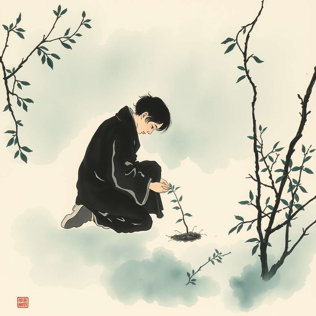
East Asian Ink Wash
Sumi-e influenced. Single-stroke brushwork, atmospheric negative space, zen minimalism. Teal-green ink washes on ivory paper.
Beautiful negative space. Teal lands perfectly. Contemplative, considered. The stamp is a Flux artefact but the mood is exactly right.
perfect
stamp
Level 1-3
high
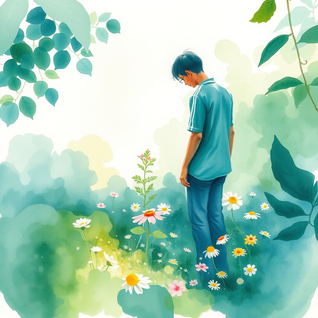
Loose Impressionist
Bold wet-into-wet washes, paint pooling and granulating, decisive brushstrokes that suggest rather than define. Bare white paper showing through.
Gorgeous teal-green palette. Authentic watercolour feel with real wet-on-wet bleeding. Fresh, light, airy. Very CoNoggin.
close
None
Level 1-5
medium
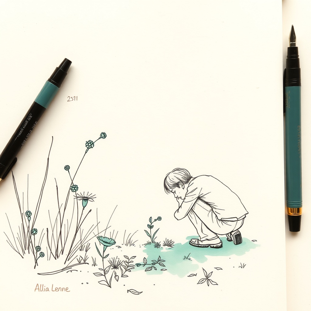
Ink Line + Wash
Fine pen linework with selective watercolour washes. Urban sketching / reportage tradition. Confident sketchy ink, colour bleeds beyond lines.
Charming sketchbook feel. The teal tint is restrained and lovely. Very consistent across subjects. The pen props are a Flux artefact.
drifts sage
tools visible
Level 1-3
very high
Botanical Modern
Scientific illustration meets editorial. Precise yet organic brushwork, layered transparent glazes, clean white background, museum quality aesthetic.
Clean, refined, professional. The teal-sage palette is subtle. Feels more "premium magazine" than "handcrafted". Polished but maybe too polished for everyday thumbnails.
drifts blue-green
None
Level 2-4
high
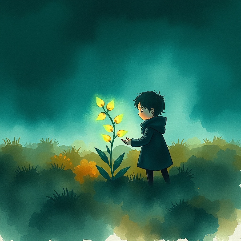
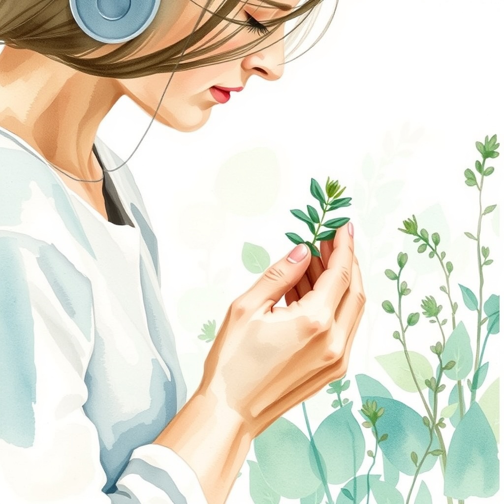
Storybook Atmospheric
Shaun Tan / Jon Klassen mood. Rich layered washes, moody palette, cinematic lighting, deep shadow, intimate narrative moments.
The teal is PERFECT here — deep, rich, atmospheric. The glowing plant is magical. This has real emotional power. Would be stunning for path/course covers (intensity 4-5).
perfect
None
Level 4-5
medium
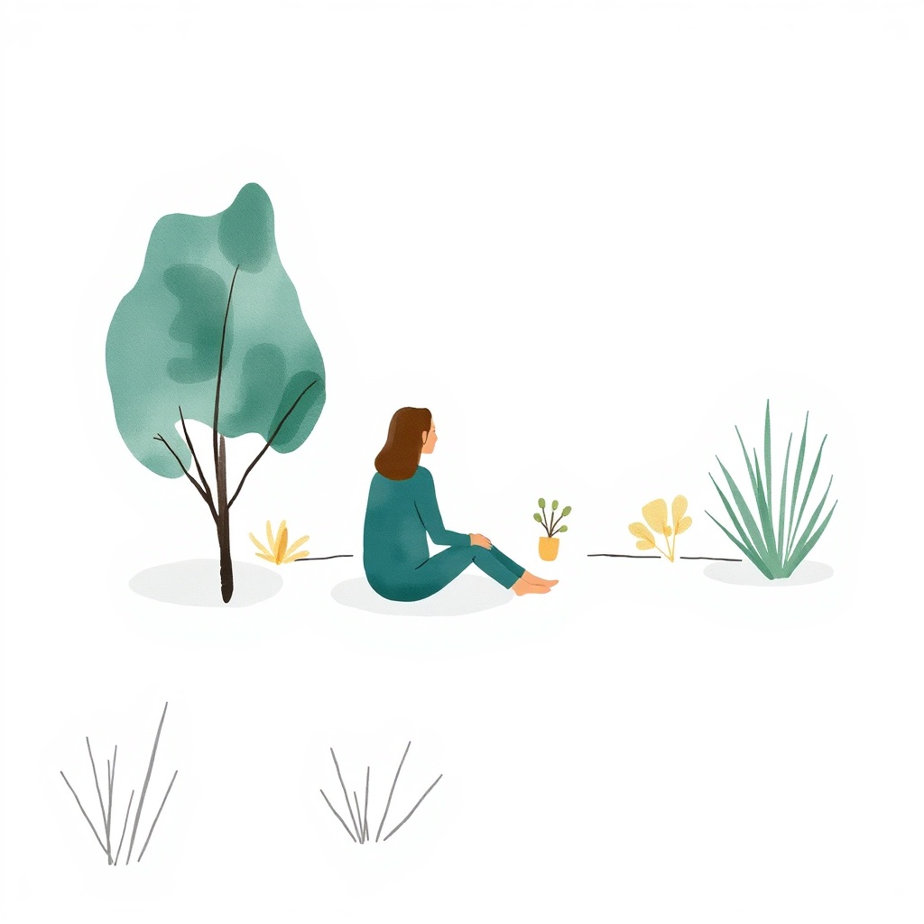
Scandinavian Minimal
Clean, flat-ish washes, geometric simplification, limited palette, generous breathing space. Contemporary editorial illustration.
Simple, clean, very "CoNoggin Oat dialect" feel. The teal-green is spot on. Most versatile for everyday use — non-tiring, flows with content. Great for whisper/quiet levels.
perfect
None
Level 1-2
very high
Analysis
Palette control
Styles A, E, F nail the teal. B is close. C and D drift to sage/blue-green. The key: use "teal-green" not "deep cyan" in prompts. Flux renders "cyan" as bright blue.
Watercolour authenticity
B (impressionist) and E (storybook) have the most convincing paint texture. F (Scandinavian) is clean but reads more "digital flat" than "painted".
Intensity scaling potential
B scales well across 1-5 (add/remove complexity). E is naturally 4-5. F is naturally 1-2. A covers 1-3 beautifully.
The "not tiring" test
F passes most easily. A and C next. B is pleasant. D and E demand more attention — fine at high intensity, tiring at low.
Recommended Direction
A hybrid approach: B (loose impressionist) as the base vocabulary, with F (Scandinavian minimal) influence at low intensities and E (storybook atmospheric) influence at high intensities. This gives authentic watercolour feel across the full dial while keeping low-intensity images calm and high-intensity images powerful.
Alt Shift Lab · Visual Production System · April 2026
Flux Schnell via fal.ai · All images generated with #3A7A7A teal palette